<- Back
Comments (183)
- danpalmerIt looks like someone getting good at illustration. Older icons are far better illustrations. However icon design is not just about illustration, it's about clarity and affordances. Icons don't exist in isolation like an illustration, they exist alongside the rest of the UX and other app icons, and being recognisable is important.All that to say, the sweet pot was likely somewhere in the middle of this timeline. The earliest icons aren't recognisable enough as they're too illustrative. The later icons aren't recognisable enough because they're too basic. The middle are pretty, clear from colour, clear from shape, well branded.
- Bad_InitialismAs the icons progress to the left, identification increasingly depends on colour and shape. Since there are a limited number of colours and shapes, they tend to get reused. This increasingly leads to mis-identification of icons.This is particularly true for the visually impaired and some elderly and neuro-atypical people.What matters in an icon is uniqueness. Only the skeuomorphic icons to the right can be unique enough for proper identification.Trendiness of visual appearance has no place in the functionality of a complex machine. If you think it does, I submit the following for your consideration: you. are. a. monster.Yes, I said that and I mean it. You followers of Jony Ive and his ilk are assholes. The rest of us don't give a shit about your design schools. We just want to be able to click on the right thing.Hate me, but it's true.
- heliographeOh hi everyone! So funny to see how my quippy little tweet blew up the last few days on all the platforms (much more than when I share actual things I make, to my great dismay - if you're an artist/photographer, check out my apps & tools: https://heliographe.studio).There's lots of interesting discussions to be had around what makes a great icon (but social media platforms aren't the places to have those deep conversations). For example the original Mac HIG says that an app icon should:- clearly represent the document the application creates- use graphics that convey meaning about what your application does(https://www.threads.com/@heliographe.studio/post/DTehlciE3wY)The first point might be a little outdated, as we tend to live in a "post-document" world, especially on mobile. The second is broad enough that it holds up, and under that lens it doesn't seem that an image of a pen/stylus is most appropriate for a word processor app.By that metric, the Mavericks/Catalina (5th and 6th on the linked image) seem like the strongest icons. The Big Sur (4th) one isn't too bad given the "must fit in a squircle constraints" that came with it, but it starts to feel less like a word processor app icon - it could as easily be an icon for TextEdit/Notes.The most recent 3 are very hard to defend - the main thing they have going for them is that because they are simpler and monochromatic, they fit more easily within a broader design system/icon family. Even then, the simpler shape doesn't make them more legible - a number of people have told me they thought it was a bandaid at first, or maybe something terminal-related for the orange on black one. The "line" under the pencil (or is it a shadow?) on the most recent one is almost as thick as the pencil itself, and blends with it because gestalt theory.I agree that the 7th one (original ink bottle) has a few issues that don't necessarily make it the best choice for an icon - but dang, the level of craft that goes into it makes it an instant classic for me. And it does retain a fairly distinct, legible shape that still makes it a solid icon even if the detail gets lost at smaller sizes.Icons need to be quickly recognizable, but at the same time an icon is not a glyph - and illustrational approach do have their place. Especially on devices with larger screens where they are going to appear quite large in most contexts.The big elephant in the room with all this is that icons 5/6/7 clearly take more craft skill to execute than icons 1/2/3, and Apple used to be the absolute reference - no debate possible - when it came to these matters. As a long time software designer (and former Apple designer myself through the 2010s, although I was on the hardware interaction design side, and not making icons), it is sad that this is no longer true.
- cstuderFurther essay on this topic: https://daringfireball.net/2026/01/thoughts_and_observations...
- hackshackBetween this, and icon-only toolbars and ribbons, I think we're reinventing Chinese, badly. Ideographic characters can often convey meaning succinctly.My vote is to either go back to picture icons, or use Chinese characters with localized pronunciation, so 車 or 车 is car, and so on.
- stego-techOne thing I'm not seeing much of in the comments, that I think is worthwhile to highlight:Every single one of these icons should be available to choose by the user.Some folks make good icons; others do not. Taste is highly subjective, and this applies to user interfaces moreso than user experience.Interfaces should always be customizable; experiences should always be consistent.
- gmd63The old skeuomorphic Apple icons were so easily distinguishable and yet still identifiable as Apple, a tough act to balance today amid competing design languages in oceans of competing apps. I thought they were great.That pen and ink icon had a classic feel to it. It made me think about the time and effort demanded by handwriting that I was bypassing by opening that app. That kind of visual poetry is lost in these flat designs, where communicating membership in a brand's ecosystem seems to beat out other priorities.
- cycomanicWhy are people arguing that icons should be intuitively tell you what the app is about? Since when was that the goal of an icon (in paritucal an app icon)? It should be easily distinguishable from other icons. If I don't know what the icon means it will take me exactly 1s to find out by clicking on it, after that I will know what the app icon is for, and I only care if I can distinguish it easily from other icons, so I don't accidentally start a different app.
- pibakerThere are many complaints about "modern" logos being illegible and how it is impossible to guess the purpose of an app from the logo and I do not understand it. There was never a period of time when you could just look at any logo and know what it is. Just to name a few examples here- Photoshop (used to be an eye, was briefly a feather, now just the word mark PS)- Foobar2000 (Alien???)- WinAMP (lightning?)- Google Chrome (I never figured out what it was supposed to be, just a ball of colors?)- Microsoft Word (what does W mean?)- Microsoft PowerPoint (look at the office 2000 version of PowerPoint, it has a pacman in it)- VLC player (what does a traffic cone have to do with playing video?)I think if anything has changed now and then, it was not how comprehensible logos became, but how cynical we ended up. We seem to have developed a knee jerk reaction to find anything about "modern tech" to hate on (on a forum owned by the company that funded much of the modern tech nonetheless) and it had colored our perception of how things really were in the past.
- kuonI'm sure design theory says the new ones are better, but the very first one was much clearer for users. Also on the phone I could say "click on the ink with the pen".
- bze12Apple mostly cares about legibility and consistency in icons now, not art. All the new iOS features like tints and liquid glass don't lend themselves well to intricate designs. It's disappointing, but I tend to agree that the skeuomorphic icons are harder to read.From their icon guidelines: "Embrace simplicity in your icon design. Simple icons tend to be easiest for people to understand and recognize. An icon with fine visual features might look busy when rendered with system-provided shadows and highlights..." https://developer.apple.com/design/human-interface-guideline...Self plug, but I made an app related to this - it's a conceptual art gallery for app icons. I thought it would be an interesting experiment to remove the functional premise and just let an icon be a decorative symbol. It's called 001 (https://001.graphics)
- BanAntiVaxxersIt seems like user interfaces should be decoupled from functionality of applications. Someone should be able to freeze their user interface in time if they wish.
- compounding_itMy sister is switching to macOS and she won’t be able to tell this is a word app. She won’t be able to notice it with the ink bottle either. These represent the pen when ideally they should represent the document which is what the word app does. I have to admit Microsoft office apps actually have / have had sensible icons.
- LandoCalrissianI tend to like skeuomorphic design, however, if you design an entire interface that way, it will look dated, for better or worse.The one in the middle is probably what I would gravitate towards myself. The right three really wear their date on their sleeve.
- benfrancomI’ve always liked Jakub Steiner’s Gnome icon work: https://jimmac.eu/
- stephen_gMy favourite is actually the one right in the middle, it’s like things improved and then started going downhill again
- nntwozzHere's a wild idea, what if the option was given to the user to select the level of detail for icons?We have such a vast library of icons now, make it an option in System Settings.Call it themes or whatever, I'm sure every macOS enjoyer would love to play with the options and reminisce.Celebrate your rich design history, don't trample it!
- timcobbNothing like arguing about icons on HN on Saturday night. Bless you folks
- samlinnferIt's just fashion, it's cyclical, what is out of style (skeuomorphism) comes into style again, then it goes away for simplicity.
- toast0It's been so long since I used a mac that I don't recognize any of these icons (or maybe it's a iPad thing?)What app is it even for? The middle one looks like writing something. The left ones look like drawing a line or testing/calibrating a stylus? The inkpot? I don't even. And the two on the middle right look like desktop publishing?
- gnarlouseIf you work at Apple, I hope you see this.
- jxdxbxIcons should not be a uniform shape.
- CharlesW"I don't like the style of Apple's icons. It's like they're not even trying!"Meanwhile, at Adobe: https://www.adobe.com/products/catalog.html
- onion2kThe icons have moved from representing a writing implement as a pen to an Apple Pencil. I doubt that's unintentional.
- gumby271Man I fucking hate this trend in icon design where they've both become so insanely basic and also tried to be "consistent" with all the icons to the point of being useless. Google started this a while back with their app icons on Android, where they all have some basic shape and the Google colors and it still sucks trying to find the right one. The horrendous icon theming users are able to do only makes it worse, reducing them to two-color versions.Microsoft did this okay until their recent liquid glass redesign, which just went further into colored blob territory.The worst are the icons that rely on the user using a previous version of the app to understand the very abstract version of the icon used today. See: https://mastodon.social/@BasicAppleGuy/115072885331562510
- undebuggableThere was more meeting time and salary budget involved in picking the yellow-red gradient inside a pen from the first icon on the left, that in the entire process of creating and releasing the icon first from the right.
- zabzonkOff-topic, I guess, but on-screen icons are not the only things you have to puzzle about. On my quite new Asus laptop (which I really like) there is a key on the keyboard that launches Asus's My Asus application, which does hardware-specific configuration. I like the app, I like easy access to it - what I don't understand is why the label on the key is "//]".
- jmpeaxFuture icon will just be this: ∠
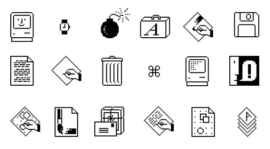
- chongliThe best icon is the original MacWrite icon by Susan Kare [1]. No superfluous details, simple, and communicates the act of writing perfectly.Susan’s suite of original icons for the Macintosh set a high watermark for legibility, usability, and comforting design. We really haven’t returned to that level of ease of use ever since.[1] https://1.bp.blogspot.com/-XLfMbsAfWqc/Vtae74eUHmI/AAAAAAAAH... (bottom row, 3rd from right)
- InsanityDe gustibus et coloribus non est disputandum.I prefer the consistent design language which is harder to do with the less abstract designs from earlier Mac days.
- walthamstowI like the middle ones but, come on, let's not pretend the ink pot isn't a load of skeuomorphic nonsense.
- moonshadow565That website (threads.com) does not load properly on firefox on phone. Most of images are missing and layout is all messed up.
- seydorIt looks like a child growing
- nemosaltat
- megablastThe designers at Apple have a lot to answer for. It’s as if we can no longer trust Apple to make new versions better.
- canadiantimWhat’s even more surprising is someone linking to a threads link!
- SecretDreamsBut why threads?
- taneqIcon design is actually really interesting because good icons are an attractor in a phase space defined by the expectations of the users of those icons. An icon doesn’t need to look like the action it represents. It needs to evoke the concept of the action when the user sees it. So in a perfect world the icon evolves towards the user’s expectation while the user learns their expectation based on the icon.
- anonundefined
- hahahahhaahNot really. Last 3 are too busy for icons. They are like clipart.
- CooCooCaChaI understand some people like skeuomorphism and that's fine. But I've noticed a certain arrogance skeuomorphism fans tend to have as if it's THE right way to design and everyone else is wrong.
- dang[stub for offtopicness]
- notaustinpowersI get what they're trying to say, but I don't think a 14yo with their first Mac is going to know what an inkwell represents. Let alone what an inkwell is.